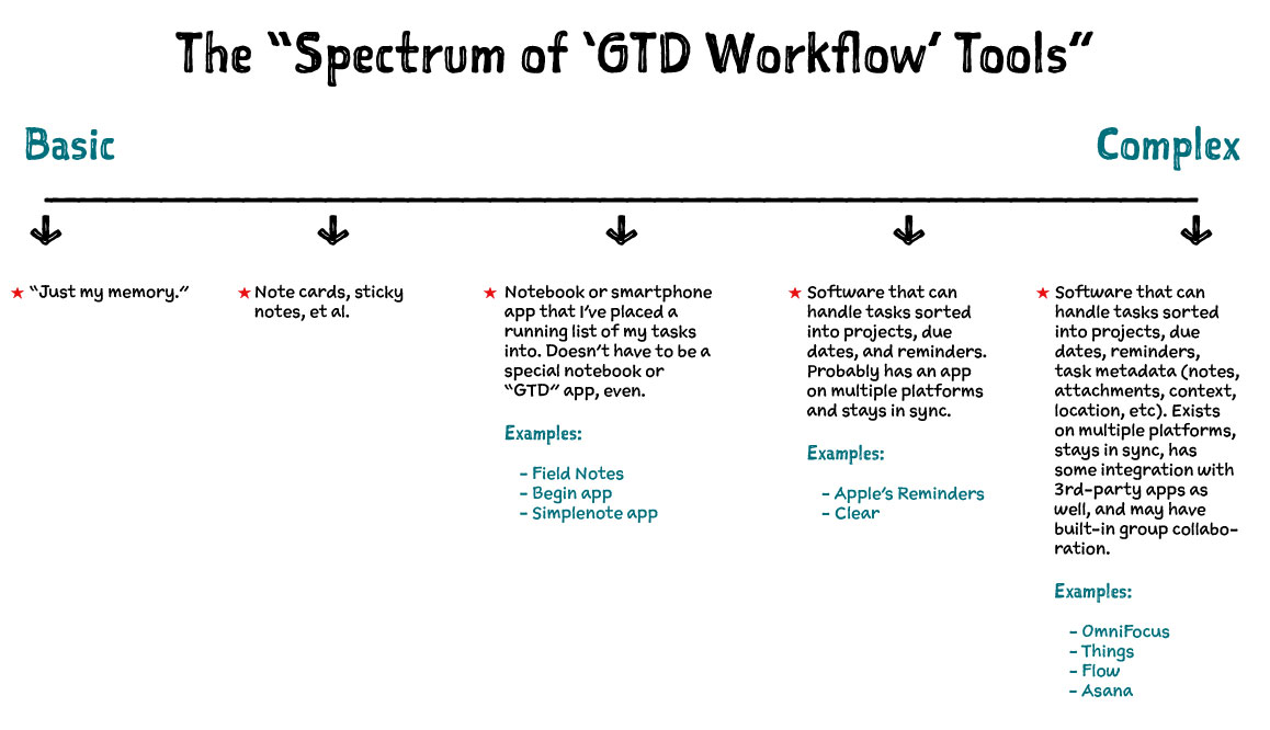
Here is a dorky chart showing what I call The “Spectrum of ‘GTD workflow’ Tools”:
What does it mean?
Basic task-management tools shine with short term tasks and goals. They are simple and have no learning curve. However, they can strain under the weight of too many tasks, long-term projects, tasks which are not yet relevant until several months from now, or tasks which need additional layers of information beyond the action item itself.
It’s because of these “shortcomings” of basic tools that more complex tools exist. The complex options excel at managing detailed and long-term projects, tasks with due dates in the far future, and action items with multiple bits of additional information.
However, the complex tools have a trade-off as well. They take time to learn, they beg us to input as much information as possible for every action item thus requiring an extra step or two (or five) when creating a new task, and it can sometimes feel like we’re spending more time managing our task system then actually doing our tasks.
And that’s why in-between the basic and complex tools are those that support a basic structure of projects and lists (and perhaps even due dates with reminders), but which don’t allow or require additional layers of information.
Somewhere along this spectrum is a tool and system that works for you.
Using too basic of a workflow tool when your circumstances require a complex one will cause unnecessary mental friction and will lead to wasted time and forgotten tasks. But using a too-complex tool when your circumstances don’t require it can lead to unnecessary management of and tinkering with your workflow and tools.
There is no single right or wrong solution here. Some of us use a certain tool for task management because our circumstances require it, and some of us a certain tool because our personality prefers it. There are also those who use a non-ideal tool because they don’t know a better option exists (or because they are too stubborn/lazy to seek out and learn the proper tool).
If you can: find a tool that makes sense to you.
Your tools should always be available to you when you want to use them for adding or completing tasks; it should be as easy and fun to use as possible for a tool like this; and it should support a system that you trust with your tasks and projects, that way you’ll be predisposed to continue using it without weighing the other options every other week.
Factors that I think are important but which should not be the ultimate deciding factors include the cost, the learning curve, and the trendiness. No doubt, for many of you reading this, the system you use to get things done is the backbone of your day-to-day work. Choosing the inexpensive shortcut may save as much as $200 and a few weeks of learning the ropes, but it may also mean taking on a long-term handicap related to your productivity. I’m not saying to go buy the most expensive software out there, but I am asking that you consider your needs and give yourself permission to invest in the best tools available that will aid you in the activities you do every single day.
My tool of choice is OmniFocus
I’ve read David Allen’s book, and I totally get it. I love it. His whole philosophy for getting things done, staying organized, and getting our task management systems out of our heads and into some other system all makes a lot of sense to me. The parking lot, the reviews, it clicks with how my brain works.
And so, yes, my own system of productivity is theoretically similar to what Allen lays out in his book. Except that my practice of “GTD” seems so very sloppy.
For the past 4 years I’ve used OmniFocus as my task-management system. Like a good wallet, OmniFocus has held together the crazy and necessary bits of my life through all sorts of seasons. From my time as a creative director managing a team of 17, to my transition as a self-employed full-time blogger, through dozens of business trips and vacations, through two kids, innumerable projects around the house, and so, so, so much more.
I’ve got a lot of crap in OmniFocus, to be honest. Like I said, my GTD system is sloppy — I don’t keep my task-management software neat and tidy because I don’t care that much. I don’t have perfectly formatted lists with thought-through start and due dates, proper contexts, accurate time estimations, or anything else. And yes, I’ll admit that I don’t always start my tasks with a verb (call, ask, go to, pick up, fall over, etc.). Also, I’m very bad at regularly reviewing all my active projects.
If I did all these things well, OmniFocus would be an ideal tool. It is SO GREAT at managing all the crazy metadata that goes along with a finely-tuned productivity workflow.
But in my years of using this app, I’ve found that it’s also great at managing my more sloppy and unorganized style of “productivity workflow.”
OmniFocus is awesome at letting me be messy and disorganized with my tasks. Because the truth is, I’d rather just be doing stuff — like writing, reading, or (ideally) sitting outside in my hammock drinking some lemonade — instead of going through all my active projects and dusting my someday-maybe list.
I’m not an OmniFocus ninja, and I don’t spend a lot of time fiddling and tweaking my software. But I have been using OmniFocus long enough to know what it’s capable of, how to use it best for my needs, to know that I still have room for improvement with how I use it, but still trust that it can handle whatever I can throw at it.
I know OmniFocus can conform to my needs, I trust it with my tasks, and based on how I use the app and how I manage my tasks and projects, I know that when something important is due, OmniFocus will let me know. Once I’ve put something into the app, I let it go. And that is worth the price of this software times ten.
How I use each version of OmniFocus
OmniFocus is a 3-app suite: iPhone, iPad, and Mac. I use all three apps daily. Here’s how:
iPhone
I predominately use the iPhone for two things: (1) quick capture of a new task, and (2) checking items off a list when out and about (such as errands, shopping, etc.)
The iPhone version of OmniFocus is my least favorite of the three apps. And, unfortunately, it’s my least favorite because it handles one of its most important functions very poorly: quick entry.
So say I’m standing in line at Chipotle and I suddenly think of an excellent topic I want to add to my upcoming book, and I want to work on it tomorrow morning during my writing time.
Here’s the steps necessary: (1) unlock iPhone; (2) launch OmniFocus; (3) tap the Quick Entry button on the bottom right; (4) enter task name: “Add cool new section to the book”; (5) tap the Project picker; (6) type in the first few letters of the name of the project; (7) tap the name of the project; (8) tap the Due date picker; (9) tap the “+1 Day” button to set the task to be due tomorrow; (10) tap “Save”.
If you don’t include the time it takes to pull my iPhone out of my pocket and unlock it, then the time it takes to enter in this “quick” entry takes about 30 seconds. Not an incredibly long time, but it’s not an easy 30 seconds.
I could just toss the task into my OmniFocus inbox and save myself half of those steps, but why would I do that when I already know the project and due date for this task? Ignoring that data is simply putting it off to a later time.
In a nut, my quibble with the iPhone is that the new task entry page does not have a clearly defined hierarchy. Thus, even after 9 months of using it every day, I’m still not familiar with the new task entry layout.
iPad
I use the iPad mostly for doing my reviews and scrubbing my daily list of things to do. The iPad version of OmniFocus was my favorite, but it’s now tied with the Mac because the new Mac version is so great.
Every morning, I scrub my to-do list by looking at what’s due today and what’s available to be done in the projects I’m excited about working on today. I start by writing down my “Big Three” tasks I want to get done (these are sometimes important tasks that are due, but they’re often part of the projects I have motivation to keep working on). These “Big Three” are how I’ll define success for my work day, and it’s what gives me the primary direction for what to work on once I sit down at my keyboard.
I also have a bit of admin and email time as part of my day, and so I use OmniFocus to tell me what specifics I’ll be working on during the day.
I then move that day’s tasks to paper and map out a rough timeline for when I plan to tackle the big tasks and when I plan to wrap up my day.

Mac
Since I work from my Mac for hours a day, I use OmniFocus here quite a bit. It’s almost always running because I send a lot of tasks into OmniFocus using the Quick Entry popup, and during my times in the day when I work through some of my “Admin” context tasks, I reference OmniFocus for what needs to be done.
And with that, let’s talk about the new version of OmniFocus for Mac.
New and Improved: OmniFocus 2 for Mac
It’s brand new, and here’s what’s most awesome:
- Gorgeous new design — finally.
- Forecast view — straight out of the iPad app.
- Much improved Review mode — also from the iPad.
- Quick Open — a way to jump to a specific perspective, project, context, or folder without leaving your keyboard.
There’s more, of course, but these are the new elements of OmniFocus 2 for Mac that I personally am most excited about.
The Design of OmniFocus 2 for Mac
Form follows function. Design isn’t just how it looks, design is also how it works. Etcetera. Well, OmniFocus 1 had the function — it worked great — but form? Not so much.
Fortunately, you could tweak the colors, typefaces, and spacing of the original OmniFocus. Myself, and others, had our own neat themes to improve slightly on the default design of the app. I felt my theme helped give some much-needed space to the app, but it never felt great.
Which is why there’s no contest about what the biggest update to the new version of OmniFocus is: the design.
For me, the complete visual overhaul of the app is reminiscent of getting my first Nintendo for Christmas — I wanted it so badly for so long and I cannot believe it actually happened. Yes!
A Visual History of OmniFocus
I’ve written about OF’s visual history before and I’d like to do so again. Not only do I think it’s interesting and fascinating, I think taking a look at how far the app has come gives some context and appreciation for the current state of the app as well as it being a brief study in user interface design.
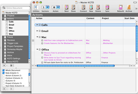
OmniFocus’s roots are as an add-on to OmniOutliner Pro called Kinkless (kGTD), which was built and developed by Ethan Schoonover. Though it was incredibly brilliant, kGTD was also a hack. It was a bunch of AppleScripts that ran on a single OmniOutliner document to bring it certain features. It also had some custom buttons and even some Quicksilver actions for quick entry.
Here is what Kinkless GTD looked like (circa 2006):
In 2006, Omni Group asked Schoonover, along with Merlin Mann, to help take the ideas and functions of kGTD and turn them into an official Omni task-management application.
Here’s the first publicly displayed mockup, showing what OmniFocus could have looked like:
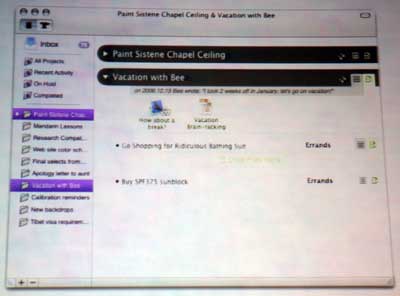
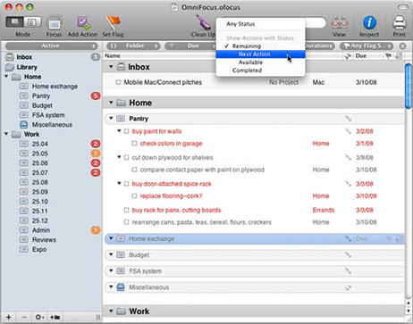
After more than a year of private development with a group of about 500 alpha users, OmniFocus went into public beta in November 2007, and in January 2008, OmniFocus 1.0 was released.
OmniFocus 1.0 (circa January 2008):
OmniFocus 1.10 (circa yesterday, May 21, 2014) :
As you can see, not much in the UI has changed from the original Kinkless implementation of 2005 to what OmniFocus is today in 2014.
But all that began to change with the first beta of OmniFocus for Mac 2.
Little over a year ago, on February 1, 2013, the beta of OmniFocus 2 for the Mac was introduced.
Beta 1 of OmniFocus 2 (circa Feb 2013):


However, during the beta testing process, the Omni Group realized they needed to go back to the drawing board, and in June 2013 they pressed pause on the public beta.
During that 5-month testing window in 2013, I gave the beta 1 a good college try but kept drifting back to my original version of OmniFocus that I’d been using for the past 4 years. In short, I never felt all that comfortable navigating that OmniFocus beta. It felt more like a fancy new theme for the Mac app and not a significant improvement of the app’s primary functionality.
Omni Group’s time at the drawing board paid off, and a couple months ago they re-introduced the OmniFocus for Mac beta with a completely overhauled design.
And that awesome design is front and center of what is shipping today.
OmniFocus 2 for Mac (May 22, 2014):
As you can see, there are quite a few noticeable changes between the beta 1 and beta 2 designs of the new OmniFocus for Mac.
For one, the left-aligned checkboxes have been swapped out with right-aligned checkcircles. The checkcircles are pretty cool, I think. For one, they’re a design cue from the iPhone app. But they’re also quite clever.
Technically, they’re called “Status Circles”. From the release notes:
Status Circles provide a colorful nexus of information about each task: is it overdue, flagged, complete, repeating?
Here’s a look at several of the various states of the status circle. (Note that all these items are due, and thus the circles are orange/red instead of grey.)

From top to bottom:
- Red means it’s overdue
- Orange means it’s due today
- Grey with a check means it’s been completed
- The blue background with blue stroke on the edge means that’s the currently selected task
- The orange box hiding behind the circle is the click target to flag an item. It appears when the mouse is hovering over a task.
- The little flag to the right means the task has been flagged. The top of the circle also turns a darker orange.
- The three dots inside a circle mean it’s a repeating task.
The right alignment of the Status Circles is growing on me. At times they feel a bit annoying because when I’m in OmniFocus to check off a task I’ve just completed, I need to first scan the left margin to find the task and then use my mouse to follow that column over to the right in order to decipher which circle on the right-side corresponds with the task on the left. But, the more I use this app the more I like the Status Circles, and their clear portrayal of an action item’s status.
Moreover, by right-aligning the circles, they fit right in with the app’s overarching task hierarchy layout, which now has a clear structure that flows from left to right:
On the left-most side are the tabs for different views. Note also that these tabs sport “color bars” to indicate when they have “interesting” content, such as due or overdue actions in the Forecast Perspective, projects that need to be reviewed in the Review Perspective, or unfilled items in the Inbox. You can adjust which tabs can be highlighted in the Notifications panel in the app’s Preferences.
Next to the Tabs column is the list of information relevant to the selected tab. If you’re in Forecast view then you’ll see a calendar, if you’re in the Projects view then you’ll see a list of all your projects, etc.
Third is the main task list displaying the tasks themselves. Here you see only the to-do items for whichever project, context, or date you have selected.
And here is why the right-alignment of the Status Circles makes sense. Because the status of a task (due, overdue, flagged, repeating, completed, available) is logically more granular than the task itself.
And lastly, on the right-most pane is the task’s information panel where you can adjust all the detailed metadata related to that task if you so desire.
Every one of the design changes in OmniFocus 2 for Mac is an improvement on an app that has been desperate for a visual overhaul for years. The visual overhaul has been worth the wait.
Quick Open
Mash down on CMD+O and the “Quick Open” dialog box pops up.

Type in the name of a project, folder, context, or perspective and it will auto-fill your text and give you live suggestions (just like you get when doing a Google search).

Quick Open is an easy and fast way to jump to any other section within OmniFocus. But I wish it were just a little bit more powerful…
Whither Universal Search?
My biggest gripe here is that I would love to see universal search. This has always bugged me in OmniFocus, and it was something I was hoping would make it into the new version. Alas, not yet.
When searching in OmniFocus you only see results (or lack thereof) based on the current view. Which means that if you are ever looking for a specific task, if it’s not in front of you already, you have to change OmniFocus’s perspective to one that will list out all your tasks in a giant list. Then you can search for that task and hopefully find it.
I would love to have a universal search that helps me find a task based on its title or note regardless of what my current view / perspective is.
Review and Forecast
The two greatest features of the iPad version are now with us on the Mac. As stated above, I now pretty much live in the Forecast view, and the review mode is just great — though I still prefer to do my reviews on the iPad. I’m glossing over these a bit here, because anyone who’s familiar with OmniFocus on the iPad or iPhone is already aware of how great and useful these two features are. Anyone new to OmniFocus entirely will get introduced to these features when first launching the app.
OmniFocus 2: Standard vs Pro
OmniFocus 2 for Mac now comes in two flavors: Standard and Pro. They cost $40 and $80 respectively (or upgrade for $20 / $40 respectively). All the information about upgrading can be found on the OmniFocus support site.
The biggest difference between the Standard and Pro version is that the latter has a few additional (and powerful) options for customization and adding your own “power features” for seeing and manipulating your tasks. But the core function of the database and everything else is there for everyone.
The Pro features are: (1) the ability to create custom perspectives and to place them in the sidebar; (2) a special Focus view with it’s own shortcut key that shows you only the currently due tasks within a certain project; and (3) AppleScript support.
From where I’m sitting, I think the Standard version of OmniFocus is probably going to be great for most people. If you don’t already know that you want the Pro features, then save some money (and fiddle-ability) and get the Standard version. While there are a lot of cool things people will tell you that you can do with custom perspectives and AppleScripts, how likely are you to utilize them?
Or, here’s another way to figure out if the Standard version is right for you: Do you almost exclusively use the default views and features in the iPad? If so, then the Standard version of the Mac app will suit you great.
However, that said, here’s a bit more information about what’s in the Pro version (and why I personally am upgrading to it):
Custom perspectives: They are nice, but I don’t find them nearly as necessary in OmniFocus 2 as I did in OmniFocus 1. In OF1 I used a custom “Today” perspective that only showed me items that are due (or overdue) today. But that perspective is moot in OF2 because I now live almost entirely in the Forecast view.
What’s nice about a custom perspective is if you have a particular project or context that you often want to bring up. You can set a project / context as its own new perspective by going to the Perspectives menu → Add New Perspective. Then, when you click the star next to the perspective, it will show up in your OmniFocus sidebar.
As always, you can set your own custom icons and images for your custom perspectives. I’d highly recommend checking out Jory’s Year of Icons and grab one of the PNGs to use as a custom icon. Unfortunately you cannot replace the default icons that OmniFocus ships with for Inbox, Projects, Contexts, Forecast, Flagged, and Review.
Focus on Folders and Projects: This is one feature I don’t utilize at all, but depending on how you have your projects and areas of responsibility organized, it could be a massive help.
When you enable Focus mode (found under the View menu), OmniFocus hides any and all tasks and projects that aren’t part of the folder or project that you’re focusing on. And they’re not just hidden from the current view, they are hidden throughout the whole app as if they never existed.
I was talking with Derek Reiff of the Omni Group about the Focus feature, and he shared with me how he uses it:
Focus is about moving away everything you don’t currently need to see. I separate my tasks at the very top level by using two folders: Work and Home. When I’m at the Omni Group office, I enable Focus on the Work folder and every view or perspective I switch to from that point on will only show Work actions and projects. Then, when I go home, I enable Focus on the Home folder to hide all my Work-related actions and projects.
If you keep the whole of your life’s tasks in OmniFocus — your job, your side hobby, your home projects, etc. — you just might love the Focus mode.
AppleScript Support: This is what compels me to upgrade to the Pro version of OmniFocus 2. I have a couple of AppleScripts that I use with OmniFocus on a regular basis, and it’s worth it for me to pay the additional cost of upgrade to continue to have access to them.
Here are some links to those scripts, only the OopsieFocus script needed to be updated to work nicely with OmniFocus 2:
OopsieFocus: An AppleScript that launches OmniFocus and brings up the Quick Entry box for you on those times you hit the Quick Entry hotkey but realize that OmniFocus isn’t actually running.
(If you’re using the Standard version of OmniFocus 2, this script can still launch OmniFocus, but it won’t be able to automatically bring up the Quick Entry box.)
Send all the Safari Tabs to OmniFocus (with this addition for adding a confirmation notification): This script grabs all the open tabs in Safari’s front-most window and creates a new to-do item in your OmniFocus Inbox with the Title and URL of each tab listed out within the task’s note.
Send current Safari Tab to OmniFocus: This isn’t an AppleScript, it’s a snippet of Javascript that’ll work with the Standard version of OmniFocus 2 (and it works in the iOS apps, too). All it does is bring up the Quick Entry box with the title of the website as the task name, and the URL of the website in the note.
Wrap up
This new version of OmniFocus is more feature-rich while also being cleaner, more organized, and more logical. The design brings a structured peacefulness to the wild animal that is my never-ending task list. And that’s quite a feat, because our to-dos are, by nature, neither structured nor peaceful.
You can get OmniFocus 2 on the Mac App Store (still propagating), or direct from Omni Group’s website.


